How to make your show website a year-round attendee growth factory
)
Marketing teams throughout the exhibition industry work their socks off to execute their marketing strategies in a bid to reach and even exceed their targets.
From PPC, social and email campaigns through to digital advertising - all of these activities drive traffic to your website in the hope that you can convert that initial interest into ticket, stand and sponsorship sales. Your event website is the centre of your show’s digital universe.
But what if your website is slightly out of kilter with your target audience and missing multiple conversion opportunities? If you don’t have a website that is converting, your marketing strategy won’t be achieving the value it deserves.
As leading event website and attendee and exhibitor growth specialists we are here to show you how conversion rate optimisation (CRO) can help event organisers improve your cost per visitor and get a better return on PPC while converting more web traffic into valuable leads, sales and registrations.
What is CRO?
The purpose of CRO is to improve the likelihood of visitors taking a desired action on a webpage. This typically involves A/B testing elements like colour, wording, content and navigational elements of your website to see what gets the best results.
Through CRO you can find out what colours, wording, UX and CTA positioning will truly unlock higher conversion rates for your show.
True Colours
It’s hard to believe, but did you know your show could be missing out on key sponsorship revenue and visitors just because the call to action button on your website is the wrong colour?
In a recent A/B testing we carried out with Informa Tech’s Ai Summit, we found that if the organiser changed their CTA button from black to orange, they would get over a 25 percent increase of visitors clicking through to their ticketing page. A massive uplift.
What colour is right for your show? While high-contrast colours will pop, low-contrast analogous colours (ones with a more subtle tonal change) may prove more eye-catching.
The only way of really knowing is by using an event marketer’s secret weapon; conversion rate optimisation (CRO).
Picture Perfect - Subliminal Stimuli
We often make decisions in our everyday lives because of subliminal stimuli. When it comes to events, how many times have you gone onto a show website and seen an image of a busy bustling show floor? Every website, right?
But ask yourself this; is it a good image to make someone want to go to your tradeshow? For an exhibitor, the likely subliminal message they receive from this picture is big crowds = a successful show. So the busy scene is good for an exhibitor page on your website. However, for a visitor, an image of exciting showfloor content is more likely to subliminally make them more eager to buy that ticket and attend. CRO allows you to test your imagery to ensure your website is picture perfect.
UX Appeal
CRO is also a brilliant way of ensuring your user experience (UX) is right for your audience. UX refers to the overall experience that a person has while visiting a website. It encompasses the website interaction between a show and its current or potential visitors and exhibitors.
At ASP, our research on UX in event websites found that potential visitors to a show make up their mind on whether they like that show or not in 2.6 seconds. Clearly first impressions count. Potential visitors and exhibitors demand an easy, efficient, and fast user experience of your event website. Therefore, good UX is a key cornerstone to converting web traffic into money on the bottom line.
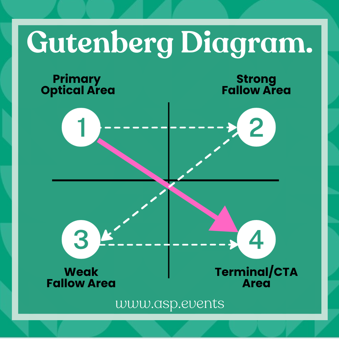
Use the Gutenberg Diagram
Page layout is all important when designing a fully conversion optimised website - and following the Gutenberg Diagram principle is a great way of capturing your visitor’s attention. In short, the Gutenberg Diagram is a visualisation of how Latin-alphabet readers — those of us who read from left-to-right, top-to-bottom, process information presented on a webpage.
The theory is that on average, most of us start looking at a website page from the top left and move right and then zig down. We don’t think to do it, we just do it. This creates an uneven distribution of attention on certain parts of the page, meaning some areas hold more value.
Gutenberg divides the page into quadrants. Readers spend the most time looking at the top-left (the primary optical area) and bottom-right (terminal area). For better conversion, we recommend putting your logo and key information in the top left of the page and then using the bottom right for your CTA.
Of course, if your show is based in countries where the audience reads from right to left (the Middle East, for example) the Gutenberg Diagram is reversed.
Keen to give your show that competitive edge?
Contact ASP today to see our team of digital marketing and event website specialists can take your show to the next level. Our newly launched attendee growth services will help you discover hidden opportunities within your data and through search engine optimisation (SEO) and conversion rate optimisation (CRO) support we can boost your website’s visibility and convert leads into sales and registrations.